A well-designed patio is more than a place to sit. It becomes an extension of the home, a space for relaxing evenings, casual gatherings, and everyday comfort. One of the most important design choices in creating that inviting space is selecting the right colors. The right tones can make a patio feel calm, lively, modern, or timeless, all while tying together furniture, landscaping, and architecture.
Choosing the best outdoor patio color schemes is not just about picking favorite shades. It involves understanding how colors interact with sunlight, natural surroundings, and materials. From selecting the right colors for your outdoor furniture to building a balanced color palette, each decision shapes the overall atmosphere.
This guide walks through practical ideas and tips to help create a patio that looks cohesive and feels comfortable all year round.
Understanding the Basics of Outdoor Color Design
Outdoor spaces behave differently from indoor rooms. Sunlight changes throughout the day, weather conditions affect materials, and nearby greenery influences how colors appear.
Bright sunlight can make bold colors appear even stronger. Soft shades can look washed out if not paired correctly. This is why planning outdoor furniture color schemes requires a thoughtful approach.
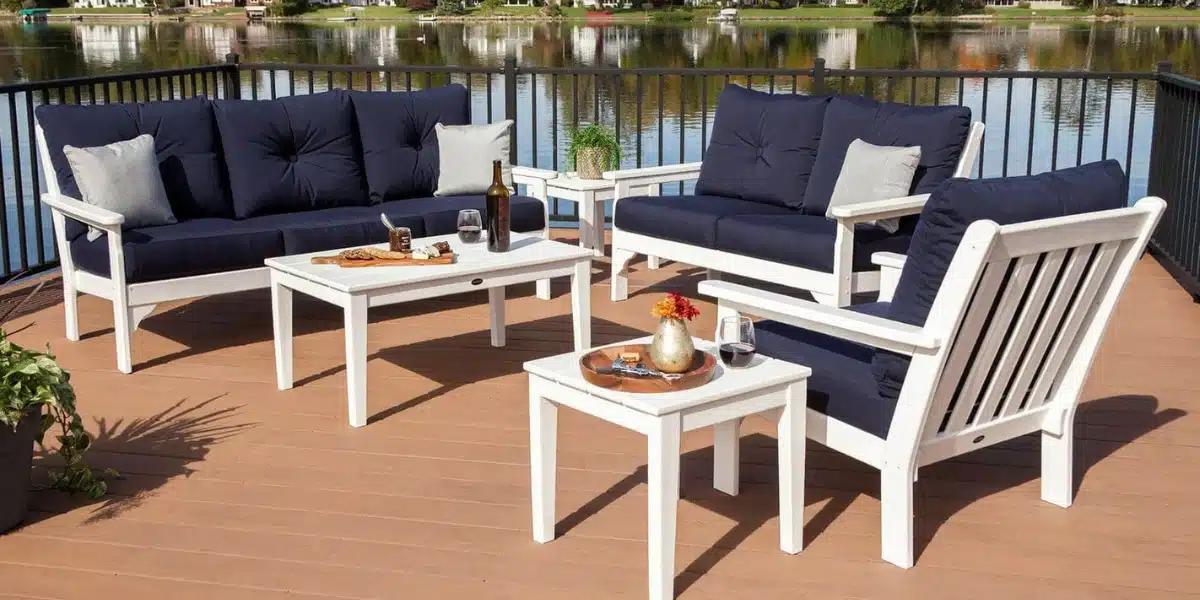
Neutral tones like beige, gray, and white create a calm base. These colors reflect sunlight and stay visually balanced. Darker tones, such as navy or charcoal, add depth and contrast, especially when paired with lighter surroundings.
Natural elements also play a role. Grass, trees, and flowers act as part of the color scheme. A patio surrounded by greenery often works well with earthy tones, while a coastal setting may call for lighter blues and sandy hues.
Popular Outdoor Patio Color Schemes
· Neutral and Earthy Tones
Neutral palettes remain one of the most popular choices for patios across the United States. Shades like taupe, sand, cream, and soft gray blend easily with outdoor environments.
These outdoor patio color schemes create a relaxed and timeless look. They also allow flexibility when adding seasonal décor like cushions or planters. Wood accents, stone textures, and natural fibers pair beautifully with these tones.
· Coastal-Inspired Blues and Whites
For a fresh and airy feel, blue and white combinations are a strong option. Light blue cushions, white frames, and subtle striped patterns can create a clean and calming atmosphere.
These colors for outdoor furniture are ideal for homes in warmer climates or areas near water. Even in inland locations, this palette brings a sense of openness and brightness. Adding hints of gray or soft beige can keep the look grounded and prevent it from feeling too stark.
· Bold and Vibrant Accents
Some patios benefit from a more energetic approach. Bright colors like coral, yellow, or turquoise can bring life to outdoor seating areas.
Instead of using bold tones everywhere, it is often better to keep the base neutral and add color through cushions, rugs, or accessories. This keeps the space balanced while still adding personality. This style works well for entertaining spaces where a lively atmosphere is desired.
· Modern Monochrome
A monochrome palette focuses on different shades of a single color. Black, white, and gray combinations are common in modern patio designs.
These color schemes offer a clean and structured look. They pair well with metal furniture, concrete surfaces, and minimal landscaping. To avoid a flat appearance, mixing textures such as matte finishes, soft fabrics, and natural wood elements helps add depth.
Choosing the Right Colors for Outdoor Furniture
Furniture often becomes the focal point of a patio, so selecting the right shades is essential. When deciding on colors for your furniture, durability and maintenance should be considered alongside appearance. Lighter colors may show dirt more easily, while darker tones can absorb heat in sunny areas.
Materials also influence color choices. For example, patio furniture is available in a wide range of finishes that resist fading and weather damage. This makes it easier to maintain consistent color over time.
Comfort plays a role as well. Cushions in soft, inviting tones can make seating areas feel more welcoming. Patterns can add visual interest, but they should complement the overall palette instead of overpowering it.
· Building a Balanced Color Palette
Creating a cohesive patio starts with a well-planned color palette for outdoor furniture. A simple method is to follow the 60-30-10 rule.
- 60 percent of the space should feature a dominant color
- 30 percent should include a secondary color
- 10 percent can be an accent color
For example, a patio might use soft gray as the main tone, navy as the secondary shade, and yellow as an accent. This balance keeps the space visually appealing without feeling overwhelming.
· Coordinating with Surroundings
A patio does not exist in isolation. It connects to the home’s exterior and the surrounding landscape.
Matching outdoor patio color schemes with the house exterior helps create a seamless transition. Brick homes often pair well with warm tones, while modern homes with clean lines may suit cooler shades. Landscaping also plays a role. Green plants naturally complement earthy colors, while colorful flowers can act as accents within a neutral palette.
Lighting should not be overlooked. Warm lighting enhances earthy tones, while cooler lighting can highlight modern color schemes.
· Mixing Classic and Modern Elements
Combining different styles can create a unique and inviting patio. A classic piece like the vintage Homecrest patio set from us can be paired with modern cushions for a balanced, contemporary, and stylish look.
This mix adds character and prevents the space from feeling too uniform. The key is to maintain a consistent color palette so that older and newer elements work together. Textures also help bridge styles. Woven materials, smooth metals, and soft fabrics can all coexist when tied together with complementary colors.
Conclusion
Choosing the right patio colors requires a mix of creativity and practical thinking. From selecting balanced color schemes to finding the perfect colors for outdoor furniture, each decision contributes to the final look and feel of the space.
A careful approach to selecting patio colors ensures all elements complement each other. Creating a unified color scheme makes the space feel comfortable, visually appealing, and ready for daily use. With well-planned choices, any outdoor area can become a welcoming extension of the home that expresses personal style while remaining practical and inviting.
Discover how our POLYWOOD patio furniture can bring your outdoor space together, complement your color choices, and enhance your patio experience with style and durability.
